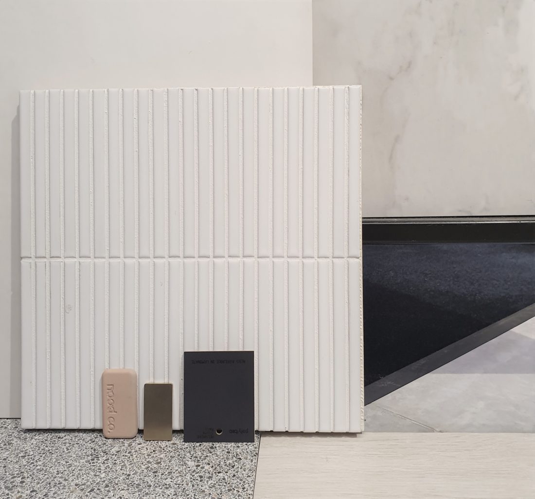
COLOUR TONES AND TEXTURES
We find all well designed spaces should provide good light and a connection to it surroundings. Therefore the simple pallete of neutral tones with a subtle use of colour can be sufficient to allow the play of light and shade to create interest within a space.
At times, a sharp contrast between elements can be an effective way to enhance colour. We find the use of ‘black’ backdrop against vegetation and enhances the many hues and tones in the foliage. We find the harsh summer light can wash the bright vibrant colours of our landscape.
When introducing colour we prefer the subtle use of colours in the detail with fixtures and fittings or with fabrics such as curtains and cushions to allow the residence to stand the test of time.
Henley House by studioJLA ( Architect )


No Comments